
PROFESSIONAL PAINTERS LONDON
Colour, surfaces, possibilities.
Take a closer look.
A photograph is a useful place to begin a decorating conversation. You may like the warmth of a wall colour, the contrast between a door and its frame or the way a pale ceiling balances a deeper shade. Use the images as references for what appeals to you, then consider how those ideas would work in your own rooms and their light.
COLOUR & FINISH IDEAS
Rooms, details,
and the work between.
Browse room colours, painted details and preparation ideas. Bring the images you like to your decorating conversation so we can discuss what would suit your own property.
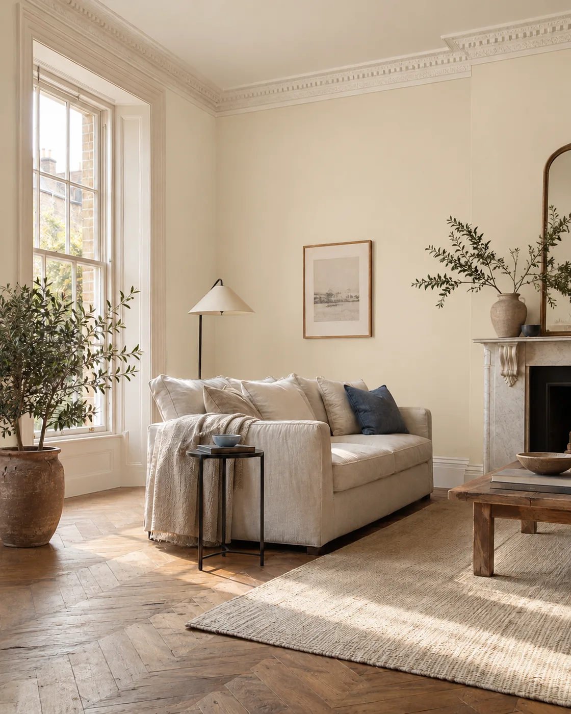
Warm neutral walls
A calm palette with a clear contrast between walls and woodwork.
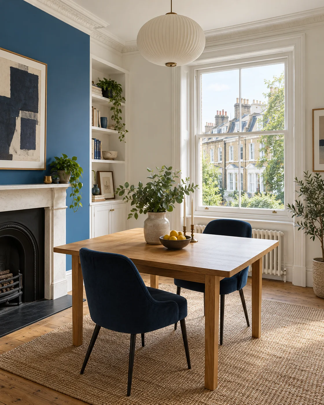
A deeper wall colour
Consider how a stronger shade sits beside windows, furniture and flooring.
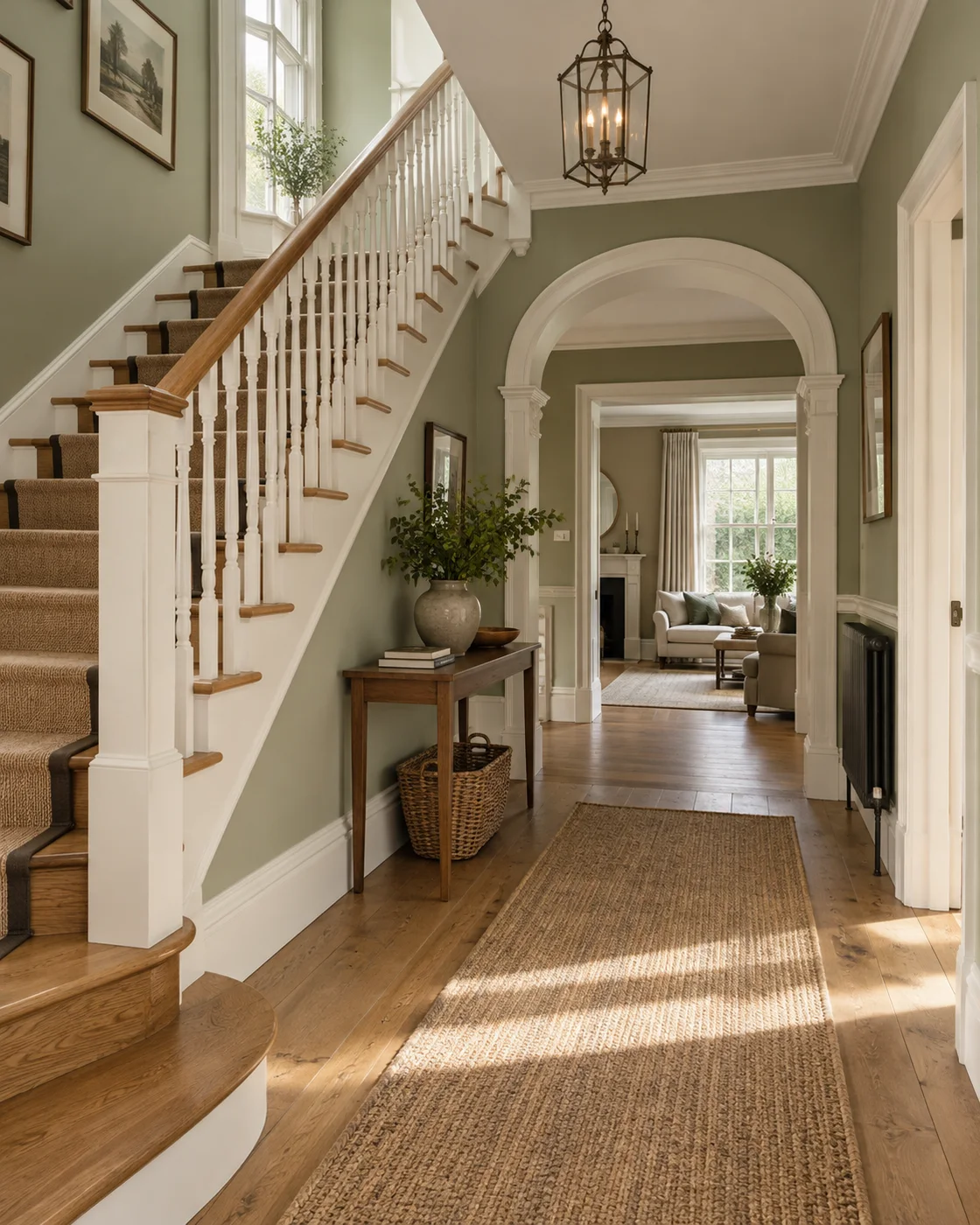
Hallway and staircase
Wall colour and painted joinery can bring a busy passage together.
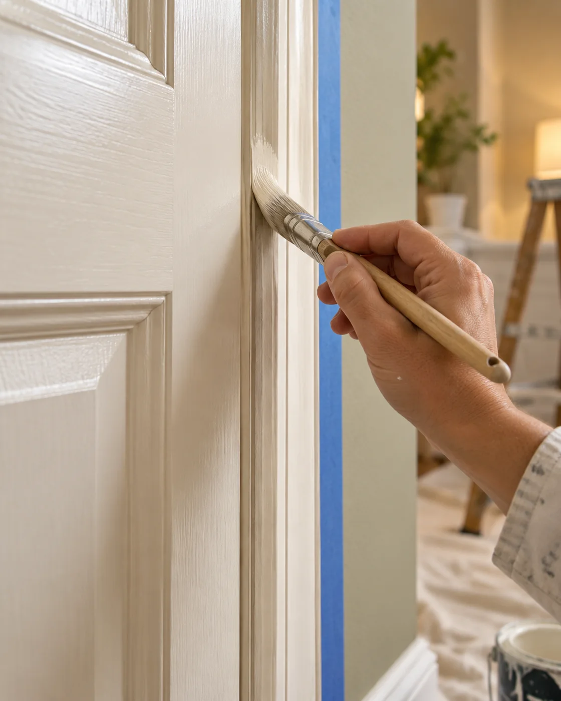
Painted woodwork
A closer look at the finish around doors, frames and skirting.
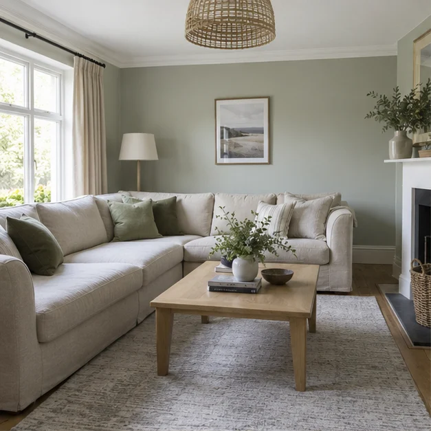
Soft daylight
Pale walls reflect light without needing a stark white finish.
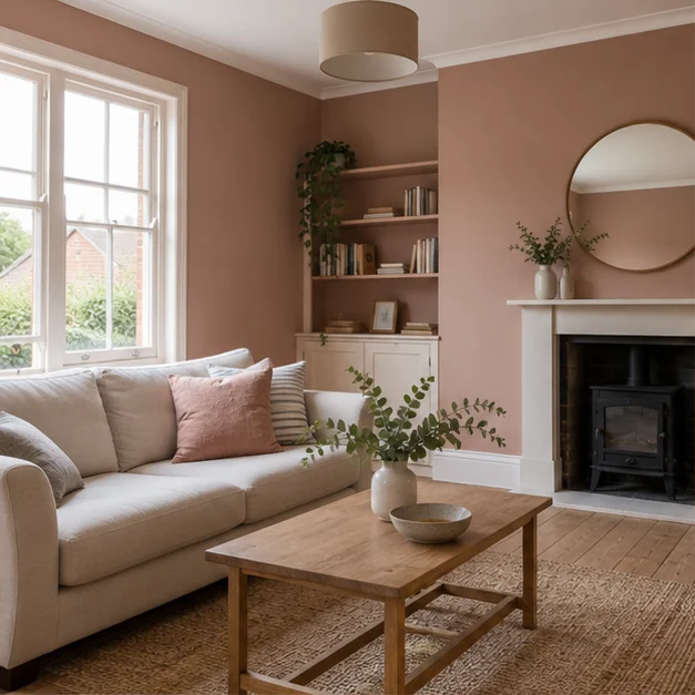
Terracotta tones
Earthy colour can add warmth to a living room or a quiet corner.
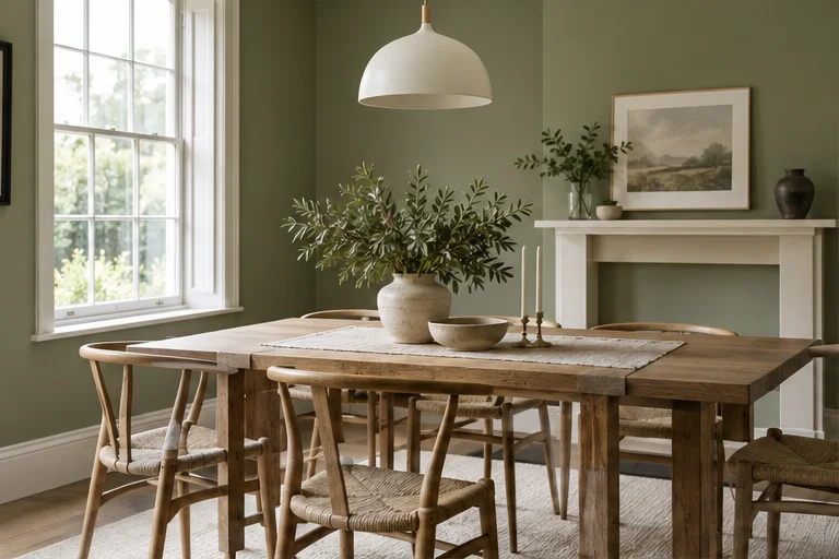
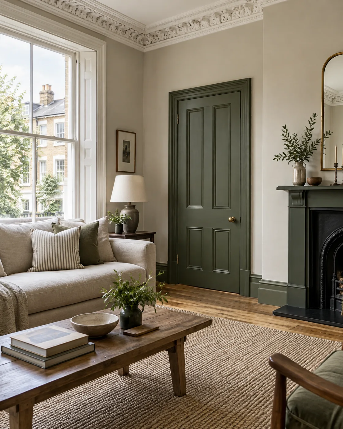
Green in a living space
A muted green provides a background for natural timber and soft furnishings.
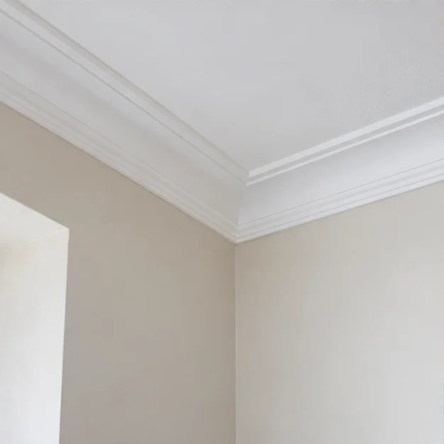
Blue and crisp trim
Compare a deeper wall colour with lighter painted details.
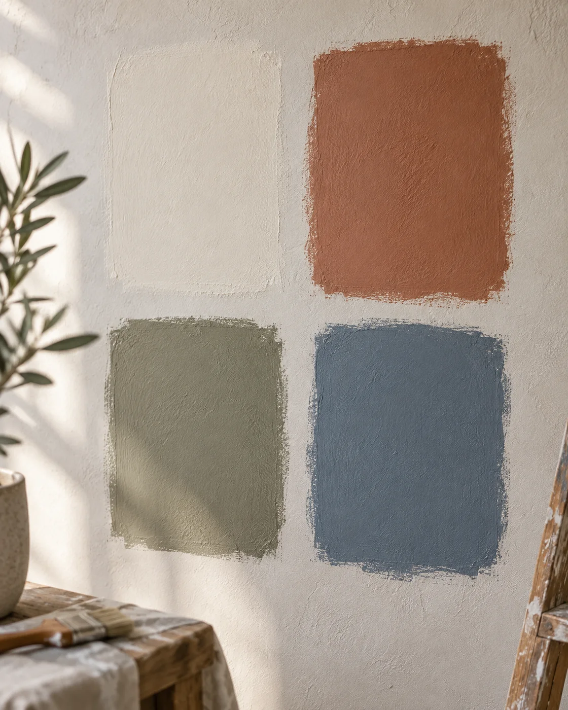
Choosing a colour
Paint samples make it easier to compare shades in the room itself.

Preparing the surface
Filling and sanding belong in the plan before the finishing coats.

A lighter workspace
Clean wall surfaces and a restrained palette suit a shared working environment.

Exterior details
Painted exterior surfaces need a finish suited to exposure and the existing material.
What the images on this site show
The new interior images used in this design are visual concepts. They illustrate colour and finishing ideas; they are not photographs of work carried out for named customers. We have kept that distinction clear so an attractive image is not mistaken for evidence of a particular project.
The existing business website has a separate project gallery. A reference to an illustrated room should begin a discussion about style, not a claim that your property will become an exact copy of it. Your surfaces, furniture, lighting and practical requirements determine the scope of the real painting work.
Warm walls and a lighter ceiling
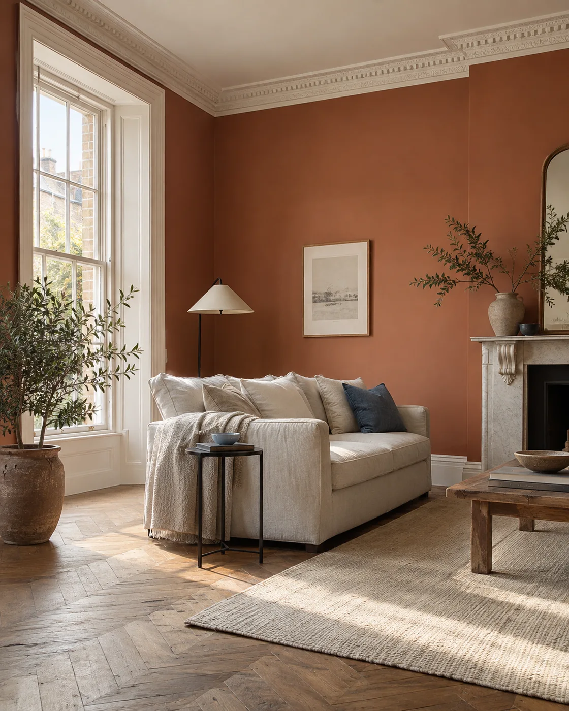
The terracotta room brings together a deeper wall colour, pale architectural detail and natural textures. What makes that combination interesting is the relationship between the surfaces, rather than a suggestion that every room should use the same palette. The ceiling and woodwork help give the stronger colour a clear edge.
If this sort of room appeals to you, look at what will remain in your own space. A dark floor, a bright carpet or cool upholstery can change the balance. Bring a sample of the colour into the room and check it beside those existing materials before deciding which surface should carry the strongest shade.
A quieter cream palette
A light wall colour can give furniture and woodwork more room to stand out. It does not have to feel unfinished or anonymous. The way a cream tone sits beside an ivory ceiling or an oak floor can be just as considered as a bold feature wall, particularly when the finish is clean and the edges are carefully defined.
Look at the colour in the light you actually live with. The same room can feel quite different in morning daylight and under evening lamps. A reference photograph cannot tell you exactly how a paint will read on your wall, but it can help you describe the atmosphere you are looking for.
Woodwork that belongs to the room
Doors, frames, skirting boards and stair details are easy to treat as an afterthought. In the illustrated staircase, the pale painted elements sit beside a natural handrail and a deeper door colour. Each part has a role, and the finish is more coherent because those decisions are considered together.
When discussing your job, include the woodwork you want refreshed and the parts you want preserved. Painting a wall beside tired skirting can draw attention to the detail you have not changed. Equally, a well-kept timber feature may be something to retain rather than paint simply because the surrounding room is being redecorated.
Use the colour slider as a comparison
The homepage slider lets you compare cream and terracotta in an illustrated version of the same room. It is a colour study, not a record of a property before and after a contractor visit. Moving the control makes it easier to see how much a wall colour can change the impression of the furniture and architectural details around it.
Use that comparison to ask better questions. Would you prefer a stronger shade across the whole room or on one wall? Does the existing ceiling need refreshing at the same time? Which colour feels right beside the floor you already have? Those questions lead to a more useful brief than choosing a room photograph without looking at its individual parts.
Looking at the details in a finished surface
When viewing real project photographs, pay attention to the junctions as well as the overall room. Edges around door frames, the line between wall and ceiling and the finish beside sockets or fittings all form part of the impression. A wide photograph may show the colour well without showing those details clearly.
At your own survey, point out the areas you care about. If a previous finish has rough edges or patch repairs, describe them. That gives the quotation something practical to address and helps make the final review about the agreed work, rather than about a vague expectation of a beautiful room.
Turn a reference into a painting brief
Choose a small number of images rather than collect dozens that pull in different directions. For each one, write a short note about what you like: the wall tone, the contrast, the woodwork or the general brightness. It is perfectly useful to like only one part of a photograph.
Then make a separate list for your property. Include the rooms, surfaces and practical arrangements. The inspiration explains the feeling you want; the room list explains the work that needs to be priced. Keeping them separate helps the discussion stay clear and avoids assuming that everything shown in a reference image is part of the decorating service.
From an idea to your own room
You do not need to reproduce an illustrated interior to give a room a fresh character. Sometimes a cleaner ceiling and refreshed woodwork are enough to make the existing wall colour feel better. Sometimes a different shade is exactly the change the room needs. Start with the surfaces you use and the things you already want to keep.
Explore our interior painting or domestic painting services, then call with your postcode and an outline of the job. If the images have helped you choose a direction, describe it. The next step is to look at your actual room, its condition and the scope required to achieve a finish that belongs there.
Questions before you book.
Are these photographs of completed customer projects?
The new interiors are clearly labelled concepts for design inspiration. They are not presented as completed client work or as evidence of a local project.
Can I use one image as a colour reference?
Yes. Explain which parts appeal to you, then test actual paint samples in your own room and discuss the surfaces you want included.
LET’S TALK ABOUT YOUR PROPERTY
A clear plan.
Starts with a call.
Tell us about your postcode, your rooms and the finish you have in mind.
Arrange a free onsite quote.